 Client Side Monitoring
Reports are only available if you are have a licensed version of
Intercept uX]
Client Side Monitoring
Reports are only available if you are have a licensed version of
Intercept uX]| Client Side Monitoring Reports [ Client Side Monitoring
Reports are only available if you are have a licensed version of
Intercept uX] |
|
| Application AJAX Calls Analysis | This report provides detailed failure analysis for a selected application. It highlights the top 5 application functionality areas that lead to most of the problems. For each area this report lists the top failure reasons. This report also provides an analysis based on problem root cause and shows application functionality areas affected by each type of problem root cause. |
| Client Latency Distribution | This report provides an analysis of client side performance in relation to network latency. Network Latency indicates the quality of a user connection by measuring the time for a packet of data to get from the server to the client browser. This report correlates the number of performance violations experienced by users with network latency, highlighting network subnets where users experience most of the problems and providing network latency information for those subnets. |
| Load Time Analysis Based on Subnet | This report provides an analysis of client side performance based on client subnets. The report identifies client subnets where users experience most of the problems and shows a response time breakdown for those subnets. The report analyzes the response time by breaking it down to Network, Server, DOM load, Peripheral Load and JavaScript Processing times. The report provides further analysis by highlighting problematic pages and AJAX calls and shows a response time analysis for them. |
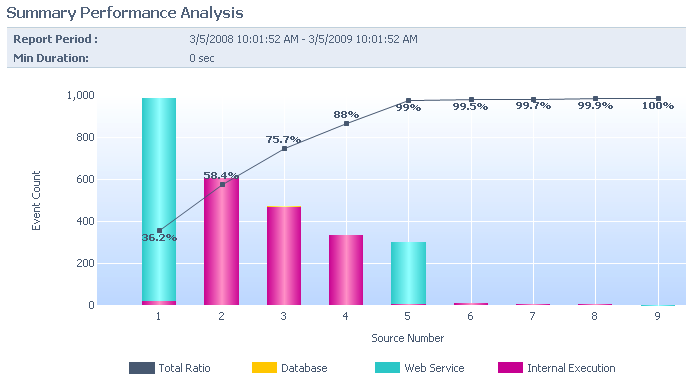
| Summary Performance Analysis | This report provides an analysis of performance violations by application. For each application it lists the top 5 problems for page requests, AJAX calls and JavaScript Actions and shows them as a percentage of total performance violations. This report further breaks down the load time by network, server processing, DOM load, peripheral loading and JavaScript processing times. |
| Summary Size Analysis Report | This report provides an analysis of content size across multiple applications and shows the correlation between content size and load time. The content size is broken down by HTML size, Image size, CSS size JavaScript size, and AJAX size. The report provides further drilldown by showing information for the top 5 heaviest pages and the top 5 heaviest AJAX calls for each application. |
| Problem Analysis Reports | |
| Application Activity Breakdown | This report shows application activity trends for a selected period in relation to an application's activity during a previous period and average application activity. This reports allows detecting any unusual spikes in the number of requests, average response time and number of errors. It provides further drilldown information about error and performance events that happen during a spike for in-depth problem analysis. |
| Application Critical Request Analysis | This report shows the list of application requests that experience most of the problems. For each request this report provides drilldown into problems happening within the request, and includes information about the frequency of each problem. |
| Application Daily Activity | This report shows application activity trends for a selected day in relation to an application's activity during a previous period and average application activity. This reports allows detecting any unusual spikes in the number of requests, average response time and number of errors. |
| Application Failure Breakdown By Resource | This reports provides failure analysis for distributed applications based on the application components and external resource dependencies. This report shows the percentage of application failures attributed to each application component and external resource dependencies. It provides further drilldown into the problem list for each component and resource. |
| Application Heavy Resources Analysis | This report provides performance analysis for distributed applications based on the application components and external resource dependencies. For each application component and external resource dependency, this report shows the percentage of application performance violations that happen due to the slow performance of a corresponding application component or external resource. It provides further drilldown into the performance violation list for each component and resource. |
| Application Resource Utilization Breakdown | This report shows application resource utilization trends for a selected period in relation to resource utilization during a previous period and average resource utilization. This reports allows detecting any unusual spikes in CPU, Memory and IO utilization. It provides further drilldown information about error and performance events that happen during a spike for in-depth problem analysis. |
| Application Slow Request Analysis | This report shows the breakdown of application performance violations based on application requests. For each application request, this report shows the number of violations along with average and maximum durations. It provides further drilldown into the performance violation root cause within each request. |
| Day of Week Utilization | This report shows application activity trends and application resource utilization trends for a selected period. |
| Hour of Day Utilization | This report shows application activity trends and application resource utilization trends for a selected period. |
| Utilization Trend | This report shows application activity trends and application resource utilization trends for a selected period. |
| Resource Utilization Analysis Reports | |
| Application CPU Utilization Analysis | This reports highlights applications that have the heaviest CPU utilization and provides a breakdown of CPU utilization based on the servers which hosts the application. This report provides further drilldown to an analysis of the CPU utilization timeline. |
| Application IO Utilization Analysis | This reports highlights applications that have the heaviest IO utilization and provides a breakdown of IO utilization based on the servers which hosts each application. It provides further drilldown to an analysis of the IO utilization timeline. |
| Application Memory Utilization Analysis | This reports highlights applications that have the heaviest memory utilization and provides a breakdown of memory utilization based on the servers which hosts each application. It provides further drilldown to an analysis of the memory utilization timelines. |
| Application Request Utilization Analysis | This report provides an analysis of application based on the volume of processed requests. It highlights applications that process the highest volume of requests and shows how request volume correlates with CPU memory and IO utilization. This report provides the utilization information for the selected application and for each server. |
| Computer Application Load Analysis | This report provides an analysis of servers based on the volume of processed requests. It highlights servers that process the highest volume of requests and shows how request volume correlates with CPU memory and IO utilization. This report provides the utilization information for the selected server and for each monitored application. It provides further drilldown to an analysis of application load and resource utilization timelines. |
| Computer CPU Utilization Analysis | This reports highlights servers that have the heaviest CPU utilization and provides a breakdown of CPU utilization based on the monitored applications running on each server. This report provides further drilldown to an analysis of the CPU utilization timeline. |
| Computer IO Utilization Analysis | This reports highlights servers that have the heaviest IO utilization and provides a breakdown of IO utilization by monitored applications running on each server. It provides further drilldown to an analysis of the IO utilization timeline. |
| Computer Memory Utilization Analysis | This reports highlights servers that have the heaviest memory utilization and provides a breakdown of memory utilization based on the monitored applications running on each server. It provides further drilldown to an analysis of the memory utilization timelines. |
| Other Reports | |
| Application Failure Analysis | This report provides detailed failure analysis for a selected application. It highlights the top 5 application functionality areas that lead to most of the problems. For each area this report lists the top failure reasons. This report also provides an analysis based on problem root cause and shows application functionality areas affected by each type of problem root cause. |
| Application Performance Analysis | This report provides detailed performance analysis for a selected application. It shows the distribution of performance events based on duration. It highlights the top 5 functionality areas that lead to response time SLA violations and provide further details about the root cause of performance slowdowns for each area. This report also provides an analysis of the top performance problems and groups those problems into application functionality areas. |
| Application Status | This report provides daily, weekly and monthly application status summaries. It shows major application activity and resource utilization KPI for a selected period in comparison to a dynamic baseline of previous periods. For applications that experience problems during a selected report period, it provides drilldown to a detailed timeline graph of problem events for the selected period. This report also highlights new problems for the period and the most critical problem for the period. |
| Problems Distribution Analysis | This report shows the distribution of performance, connectivity, security and code problems across all monitored applications, highlighting the applications that are most problematic. For the applications that contribute to the majority of problems, this report provides more detail by showing application components and external dependencies that are the root cause of those problems. |
| Summary Failure Analysis | This report provides a breakdown of problems by application. For each application, it lists the top 5 problems and shows them as a percentage of the total problems. This report is a perfect example of the 80-20 rule, where 80% of all failures happens due to 20% of the problems. This report highlights the top problems and allows management to concentrate on resolving the problems that affect their applications the most. |
| Summary Performance Analysis | This report provides a breakdown of performance violations by application. For each application it lists the top 5 problems and shows them as a percentage of total performance violations. This report is a good example of the 80-20 rule, where 80% of all failures happens due to 20% of the problems. This report highlights the top problems and allows management to concentrate on resolving problems that affect their applications the most. |
| Summary User Analysis | This report highlights the application users who experience most of the problems. For each user the report shows performance, connectivity, security and application failure problems. For performance problems the reports shows the top 5 problematic requests for the selected user and how the response time for that user compares to the average response time for the system. |
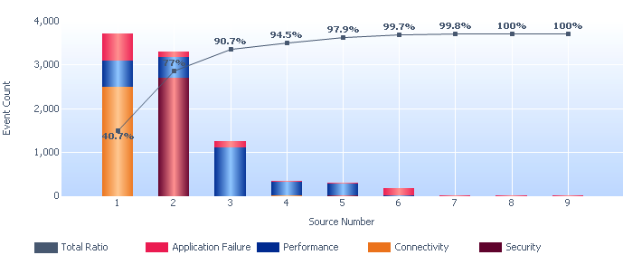
The Pareto chart provides facts needed for setting priorities based on the Pareto principle that 80% of problems usually stem from 20% of the causes. Pareto charts help teams focus on the small number of really important problems or causes of problems. Pareto charts organize and displays information to show the relative importance of various problems or causes of problems, and are therefore useful in establishing priorities by showing which are the most critical problems to be tackled or causes to be addressed. Comparing Pareto charts of a given situation over time can also determine whether an implemented solution reduced the relative frequency or cost of that problem or cause.
A Pareto chart is a special type of bar chart where the values being plotted are arranged in descending order. The graph is accompanied by a line graph which shows the cumulative totals of each category, left to right.
The bars are placed on the graph in descending order of frequency, which makes it easy to identify those problems that are of greatest importance or those causes that the most frequent reasons for customer complaints. The left vertical axis generally displays the frequency of occurrence (number of events), but it can also represent any other important unit of measure. Each vertical bar represents the contribution to the total from a given "problem" area, and each vertical bar may be further broken down into color-coded parts representing the relative distribution of problems by such things as aspect (Application Failures, Connectivity, Performance, etc) or resource type (database, web service, internal execution, etc). A cumulative line is used to add the percentages from each bar, starting at the left (highest cost or count) bar. Thus, we can see which bars contribute the most problems, and with the cumulative line, determine how much of the total problem will be fixed by addressing the highest few.
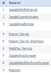
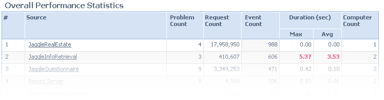
Note that there is generally a number on the x-axis of the chart with a label such as "Request Number" or "Source Number" below it. The detail table below the chart acts as a key to the meaning for each number. For example:
When to Use a Pareto Chart
Things to look for:
In most cases, two or three categories will tower above the others. These few categories which account for the bulk of the problem will be the high-impact points on which to focus. You can also:
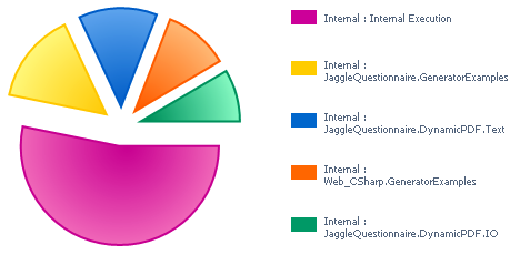
Pie charts are divided into sectors illustrating relative magnitudes or frequencies or percents. In a pie chart, the size of each sector is proportional to the quantity it represents. Together, the sectors create a full disk. Like with the Pareto chart, a pie chart gives an immediate visual idea of the relative impact of various problems or causes of problems, and are therefore useful in establishing priorities by showing which are the most critical problems to be tackled or causes to be addressed. Each sector is color coded to reflect the measurement described in the accompanying key.
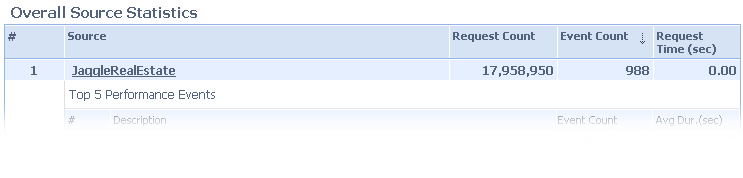
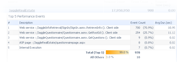
Most of the reports follow the initial graph with an overview table of the data used to create the graph, with one row for each point on the x-axis, such as problem sources. The initial table is usually followed by a series of detail tables, one for each row of the overview table. Additional sub-tables may appear within each detail table.
Example:
The "Summary Performance Analysis" report displays:
Last update: Thursday, December 09, 2010 02:42:45 PM